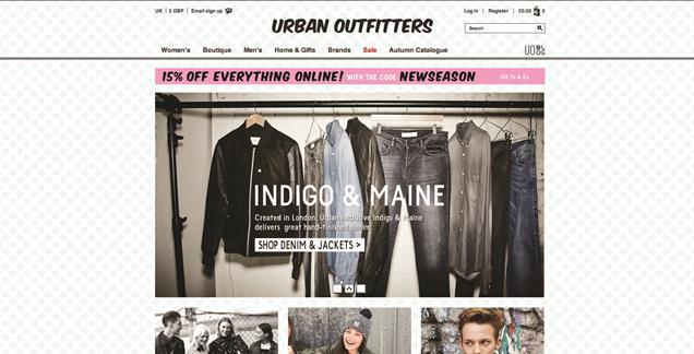
In this website they have used a simple text for their logo, the design of the website is plain. I think a lot of neutral colours has been used as it is getting into the Autumn/winter season. They have included pictures of different outfits to show the lastest trends for both male and female. The website also has widgets that you can click on to go on their Facebook, Twitter, Pinterest and Instagram, this is a great idea as this can keep you updated on the latest trends. Before they created this website they probably planned it by making drawings of ideas that they had.

2.Topshop
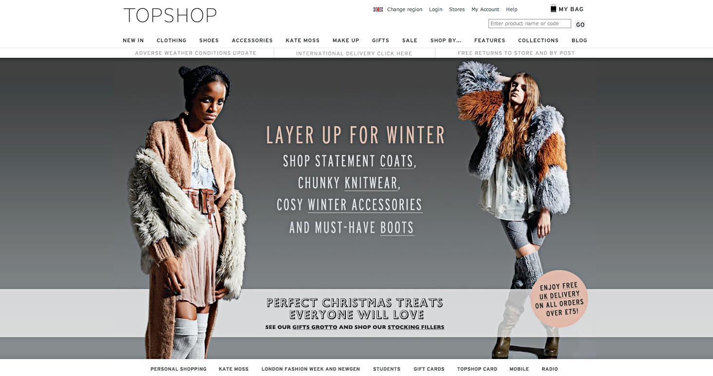
This website also has a simple design, They have chosen black for their logo and it is also plain. I think the neutral tones are dominant on this website as it is the Autumn/Winter season. I think this website is unbalanced because they have mostly used Neutral colours on their website. The colours used on this website is warm which makes you feel calm.
3.Selfridges
This website has a contrast in colours, they have chosen to use black and white for their logo. Their logo is also simple. I think black and white is the dominant colours on this website. This makes the website unbalanced as a lot of black is used making it look really dull and boring. The colours used for this website is monochromatic. The font is bold and the colour used for the text is bright and colourful. I think the bright colours used for the text makes the website less boring.

Typography
For the word 'Dull',I chose that specific font because I thought it looked plain as there were a lot of straight lines. This made it not stand out which was how I wanted it to be. I had arranged the colours in that way because i wanted it to go from dark to light also I chose the colour that was dominant on the website first and the one that doesn't really stand out last. This made more sense as when I looked at the website I could see if the colours used was dull or if it stood out to the customers. For this font I did not use any additional techniques such as gradients and outline, I just left the font the same and added a dark colour. I think that the font I had chosen went well with the word that I had chosen and also the colours that I chose to use from the colour chart suited the font. I can improve it by experimenting with the gradient and outlines.
For the Vibrant word I decided to choose a bold font because I wanted the word to stand out. From the colour chart I had decided to choose the colour that is not really dominant on the website but would make the word stand out which was the red colour as I thought that it is bright and it would captivate the viewers attention. For the font I did use additional techniques such as the gradients to make the outline thicker, this had made it stand out even more which suits the word. I can improve this experiment by choosing different colours from the colour chart to see if it goes with the font and the word 'Vibrant'.


For the word boring I decided to choose a dark colour and I also decided to only do one colour, i thought this was suitable because it made the word not stand out well as for the vibrant I had decided to use two colours which was bright so the word stood out. I also made this word thinner than the word vibrant. I have also decided to use a simple font.
For the word 'Warm' I decided to use a bubbly font and neutral colours. I have made the colour of the outline lighter which would contrast with the colour of the main part of the bubble writing. The colours also goes with the font that I have chosen.
No comments:
Post a Comment